
E-commerce analytics dashboard: your 2026 guide
An e-commerce analytics dashboard is a centralized, visual interface that consolidates key online retail metrics into a single view, giving teams the data they need to act quickly and confidently. The best dashboards go far beyond reporting. They explain why metrics shift, flag problems before they compound, and point toward the next decision. Data-driven stores using effective dashboards achieve 28% higher revenue lift, 35% better customer retention, and twice the speed in responding to market changes compared to teams relying on intuition. If your current setup only tells you what happened yesterday, it is not a dashboard. It is a report.
What KPIs must an e-commerce analytics dashboard include?
The metrics you track define the decisions you can make. Choosing the wrong KPIs fills your dashboard with numbers that look busy but drive nothing. The right ones connect directly to revenue, customer behaviour, and operational health.

Revenue and conversion metrics
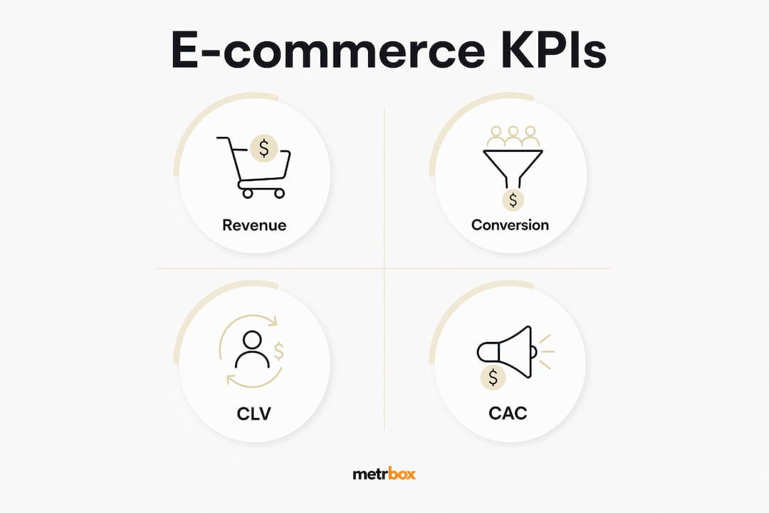
Revenue Per Visitor (RPV) is the single most important headline metric on any ecommerce dashboard. It combines conversion rate and average order value into one number, directly linking traffic quality to revenue performance. RPV = Total Revenue ÷ Total Sessions. A rising RPV tells you that both your traffic and your offer are working together.
Alongside RPV, your dashboard needs these core conversion metrics:
- Conversion rate: Industry benchmark sits at 2–3.5%. Anything below 2% signals a friction problem in your funnel.
- Cart abandonment rate: Keep this below 65%. Higher rates typically point to checkout friction, unexpected shipping costs, or trust gaps.
- Checkout completion rate: Tracks the share of shoppers who start checkout and finish it. A low rate here is more specific and more fixable than a high abandonment rate alone.
Customer and acquisition metrics
Customer Lifetime Value (CLV) and Customer Acquisition Cost (CAC) are the two metrics that determine whether your business model is sustainable. The standard benchmark is CLV ≥ 3× CAC. If your ratio falls below that, you are spending more to acquire customers than they return over time.
Operational KPIs
Inventory turnover, fulfilment speed, and return rate belong on every operational dashboard. These metrics affect margin and customer experience directly. A rising return rate, for example, often signals a product description problem or a sizing issue, not a logistics failure. Catching it early saves both money and reputation.
Pro Tip: Set automated anomaly alerts to flag any metric that deviates more than 15% from its rolling 7-day average. This threshold catches real problems without generating constant noise from normal fluctuation.
How to design an e-commerce dashboard that drives decisions
Dashboard design is where most teams go wrong. They add every metric they can find, end up with 40 widgets, and then nobody uses the thing. Good design is about subtraction, not addition.
The three-layer architecture
A three-layer dashboard structure separates information by decision speed and audience. Each layer serves a different purpose:
| Layer | Audience | Cadence | Focus |
|---|---|---|---|
| Executive overview | Leadership, founders | Daily | Revenue, conversion rate, RPV |
| Operational metrics | Managers, analysts | Weekly | Fulfilment, CAC, cart abandonment |
| Strategic analysis | Senior analysts, directors | Monthly | CLV trends, channel mix, cohort data |
This structure keeps each audience focused on the decisions they actually own. An executive does not need to see inventory turnover every morning. A fulfilment manager does not need a monthly cohort analysis on their daily view.
Widget count and metric ownership
Limit your dashboard to 8–12 focused KPIs. Research confirms that dashboards with more than 12 widgets see lower daily engagement and slower decision cycles. Every metric on the dashboard needs an owner: one person responsible for monitoring it and acting when it moves. Without ownership, anomalies get noticed and ignored.
Position your most critical metrics in the top-left of the layout. Most readers scan left to right, top to bottom. RPV, conversion rate, and revenue belong in that prime position. Group related KPIs by theme: acquisition metrics together, retention metrics together, operational metrics together.
Pro Tip: Treat dashboard clutter the same way you treat a slow page load. Both degrade performance. If a metric does not connect to a decision someone makes this week, remove it.
What role does analytics depth play in modern dashboards?
Not all analytics are equal. Modern e-commerce analytics operate across four distinct layers, and the most effective dashboards integrate all of them.
- Descriptive analytics: Answers “what happened?” Reports on past sales, traffic, and conversions. This is where most dashboards stop.
- Diagnostic analytics: Answers “why did it happen?” Connects a drop in conversion rate to a specific traffic source, device type, or product category.
- Predictive analytics: Answers “what is likely to happen?” Uses historical patterns to forecast demand, churn risk, or seasonal peaks.
- Prescriptive analytics: Answers “what should we do?” Recommends specific actions, such as adjusting ad spend or triggering a re-engagement email sequence.
The key difference between a reporting tool and a true analytics dashboard is actionability. A report tells you conversion dropped 12% last week. An analytics dashboard tells you it dropped because mobile traffic from paid social had a 4.2% conversion rate versus the 2.8% site average, and it suggests reviewing your mobile landing page experience.
Segmentation is where diagnostic analytics becomes genuinely powerful. Breaking down conversion rate by device, channel, and product category reveals variations that aggregate averages hide entirely. A 2.5% overall conversion rate can mask a 4.1% rate on desktop and a 1.3% rate on mobile. Without segmentation, you would never see the problem.
AI-assisted prescriptive analytics is now entering mainstream e-commerce platforms. Tools that surface AI anomaly detection can flag a conversion drop within hours of it starting, rather than after your weekly review. That speed difference translates directly into recovered revenue.
Pro Tip: If your dashboard only answers “what happened,” you are using a reporting tool, not an analytics platform. Add at least one diagnostic view, such as conversion rate by traffic source, to start building genuine analytical depth.
Practical steps to build an effective ecommerce analytics dashboard
Building a dashboard without first defining its purpose produces a report nobody reads. The steps below follow the sequence that actually works.
Define your dashboard users and their decisions. An executive needs daily revenue and conversion snapshots. An operations manager needs fulfilment speed and return rates. Start by listing the three decisions each audience makes weekly, then build metrics around those decisions.
Identify and connect your data sources. The most common sources for e-commerce dashboards are Shopify for transactional data, GA4 for behavioural and traffic data, your CRM for customer lifetime and retention data, and ad platforms for acquisition cost. Each source answers a different question. Connecting them gives you the full picture.
Select metrics tied to specific decisions. Successful dashboards map every KPI to a business question and assign a named owner. If you cannot name the decision a metric supports, remove it from the dashboard.
Set update frequencies that match the metric type. Revenue and conversion rate benefit from real-time or daily refresh. CLV and channel mix analysis are monthly metrics. Refreshing monthly metrics daily adds noise without adding insight.
Embed automated alerts. Configure threshold alerts for your most critical KPIs. A 15% deviation from a rolling average is a reliable trigger point. Alerts move your team from reactive to proactive without requiring anyone to stare at a screen all day.
Refine based on usage and feedback. After four weeks of use, audit which metrics your team actually references in meetings and which ones nobody mentions. Remove the unused ones. Add what is missing. A dashboard is a living tool, not a one-time build.
Learning how to turn insights into action is the skill that separates teams who build dashboards from teams who benefit from them.
What I have learned about dashboards that most articles skip
The most common dashboard failure I see is not a technical one. It is a political one. Teams build dashboards by committee, every stakeholder adds their favourite metric, and the result is a 35-widget screen that nobody trusts and everyone ignores. The fix is not better software. It is a clear owner with the authority to say no.
The second thing most articles miss is the power of segmentation over aggregation. Average metrics are almost always misleading. A 3% conversion rate sounds healthy until you segment by device and find that mobile converts at 1.1%. That single insight can redirect an entire quarter of work toward mobile UX improvements that actually move revenue.
Analysts and business managers need to work in the same room when building dashboards. Analysts know what the data can show. Managers know what decisions they actually make. Without both perspectives, you get technically correct dashboards that answer questions nobody asked.
The future of ecommerce dashboard analytics is embedded and automated. The teams gaining ground right now are not the ones with the most data. They are the ones whose dashboards surface the right signal at the right moment and connect it directly to a workflow. Measuring marketing ROI with that level of precision is no longer reserved for enterprise teams with large data engineering budgets.
How Metrbox helps you build dashboards that actually work
Metrbox specialises in turning fragmented e-commerce data into clear, decision-ready dashboards. Whether you are connecting Shopify, GA4, and your ad platforms for the first time or rebuilding a dashboard that has grown too cluttered to use, Metrbox builds bespoke measurement systems tailored to your team’s actual decisions.
The Metrbox approach starts with your business questions, not your data sources. From there, the team identifies the right KPIs, connects the relevant platforms, and sets up automated alerts so your team responds to problems in hours, not days. If you are ready to move from reporting to real analytics, explore Metrbox’s analytics measurement tools or reach out directly to discuss your dashboard needs.
FAQ
What is an e-commerce analytics dashboard?
An e-commerce analytics dashboard is a centralized visual interface that consolidates key online retail metrics, such as revenue, conversion rate, and customer lifetime value, into a single view to support faster business decisions.
What is the most important KPI on an ecommerce dashboard?
Revenue Per Visitor (RPV) is the top headline KPI because it combines conversion rate and average order value into one number that directly connects traffic quality to revenue performance.
How many KPIs should an ecommerce dashboard display?
Effective dashboards limit KPIs to 8–12 focused metrics. More than 12 widgets reduces daily engagement and slows decision-making.
What is the difference between a reporting tool and an analytics dashboard?
A reporting tool shows what happened. An analytics dashboard explains why it happened and recommends what to do next, making it a decision-support tool rather than a historical record.
How often should an e-commerce dashboard refresh its data?
Revenue and conversion metrics benefit from daily or real-time refresh. Customer lifetime value and channel mix are monthly metrics and do not need more frequent updates.

How to track AI referral traffic in GA4 with Google Tag Manager
AI traffic is messy. Someone can ask ChatGPT, Perplexity, Gemini, Claude, Copilot, or another AI too

Top 3 Supermetrics Alternatives 2026
Explore these 3 supermetrics alternatives to help you choose the best data integration solution for

Measure to Maximize: Your Roadmap to Google Analytics 4
Let's be real. We're in the business of proving ROI. That means proving our ROI, too. And if you're